The chart has the following main components:
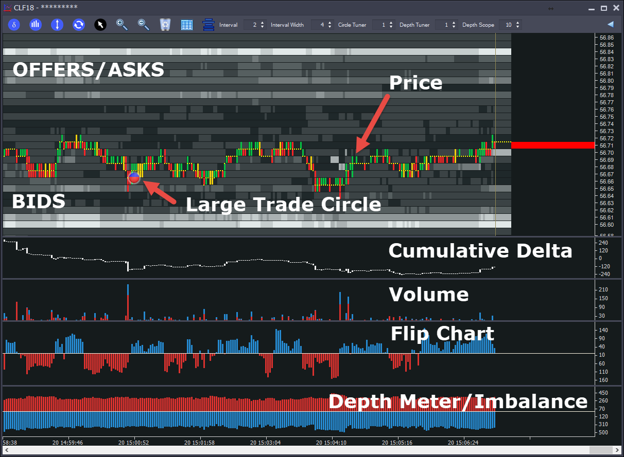
•Price - The price chart shows where we traded as well as balance of trade.
oGreen - Indicates that we traded more buy market orders than sell market orders.
oRed - Indicates that we traded more sell market orders than buy market orders.
oYellow - Indicates balanced trades
•Bids - Below the Price Chart, we have the bids. Buy Limit Orders. The darker colored area represents an area where the bids were low. The lighter area shows where the bids were higher. The shading from low to high is done automatically and there are 8 shades representing different levels of depth.
•Offers - Above the Price Chart, we have the offers/asks. Sell Limit Orders. These are in red above. The darker colored area represents an area where the offers were low. The lighter area shows where the offers were higher. The shading from low to high is done automatically and there are 8 shades representing different levels of depth.
•Large Trade Circles - These circles appear when we have an exceptional amount of trade occur at a price over time. As long as we continue trading at a price, it will accumulate the amount traded and if this is considered to be exceptionally large (proprietary algorithms decide what is large, there are no settings for you to make), then a circle will appear. The color of the circle represents the balance of trade. Blue represents buy market orders and red represents sell market orders. In the above example, we can see we have more red, which means more sell market orders. Note that you can click the circle to see amount traded there.
•Cumulative Delta - This panel can be switched on and off. It shows the total traded at offer (buy market orders) minus total traded at bid (sell market orders) over time. Useful for setting bias. For example a typical reversal up on the S&P500 Futures will see delta swing up 10k contracts.
•Volume - Shows total volume traded per interval. With the red area representing sell market order volume and the blue area the buy market order volume
•Flip Chart - Shows order book flipping activity, for example when the buyers stack the bids and sellers pull offers, we consider the market to be flipping to the upside and that is represented in red.
•Depth Meter/Imbalance - Shows balance of order book - red above and blue below OR offers - bids, showing the imbalance of the order book.
History Vs Real Time
The chart moves from left to right. There is a slim vertical bar (History Separator) that moves from left to right with the price:
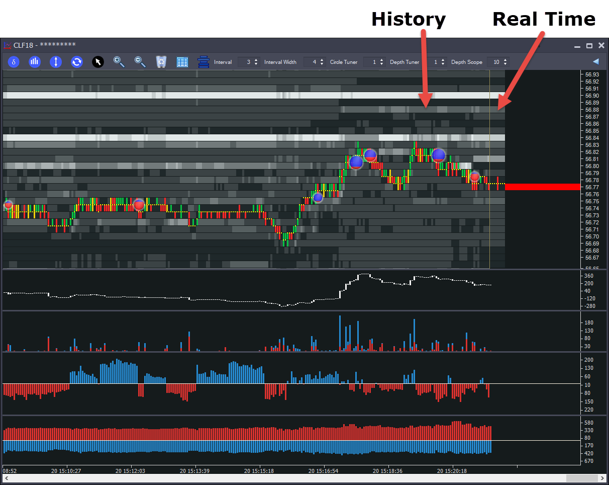
Everything to the left of the History Separator is historical information. To the right of the Separator is current information. The current bids/offers and trade levels.
Note that whilst most markets only supply 10 or 20 levels of depth, Auction Vista remembers what was bid/offered at each level beyond that and will display as historical information.
Cumulative Delta
The ![]() button enables/disables the cumulative delta panel:
button enables/disables the cumulative delta panel:
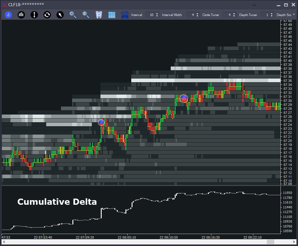
This is a rolling history of buy market orders minus sell market orders. It is mostly used to set bias. For example a typical reversal on the S&P500 futures will see the delta shift in the new direction usually with around 10,000 contracts shift in the delta.
Volume Chart
The ![]() button enables/disables the Volume Chart panel:
button enables/disables the Volume Chart panel:
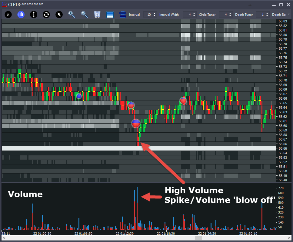
This shows the volume per interval. The coloring shows the proportion of buy(blue) and sell (red) market orders in each interval.
Flip Chart
The ![]() button enables/disables the Flip Chart panel:
button enables/disables the Flip Chart panel:
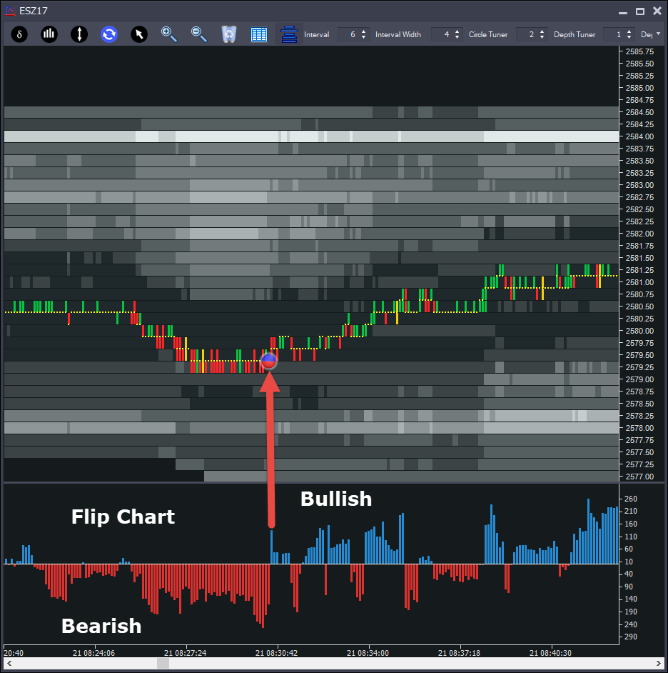
The Flip Chart is a visual representation of pulling/stacking activity, similar to the Snapshot Meters. You decide how many levels of depth to analyze and the chart will plot whether the pulling/stacking overall is bearish (red) or bullish (blue).
In the above example, we can see that overall we had order book pulling/stacking was bearish and the peak was around -250 contracts acitivity (overnight), which then flipped to long just before price moved up.
Market Depth/Depth Imbalance Chart
The ![]() button enables/disables the Depth Chart. The chart has 2 modes.
button enables/disables the Depth Chart. The chart has 2 modes.
•Depth Mode - visual representation of market depth (number of levels to analyze can be customized) - showing sum of all offers (red) and bids (blue)
•Imbalance Mode - visual representation of Order Book Imbalance. Red = more offers than bids, Blue = more bids that offers.
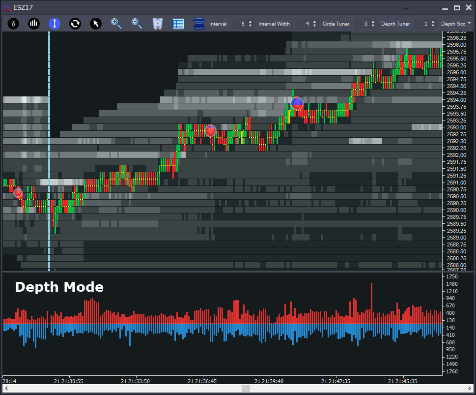
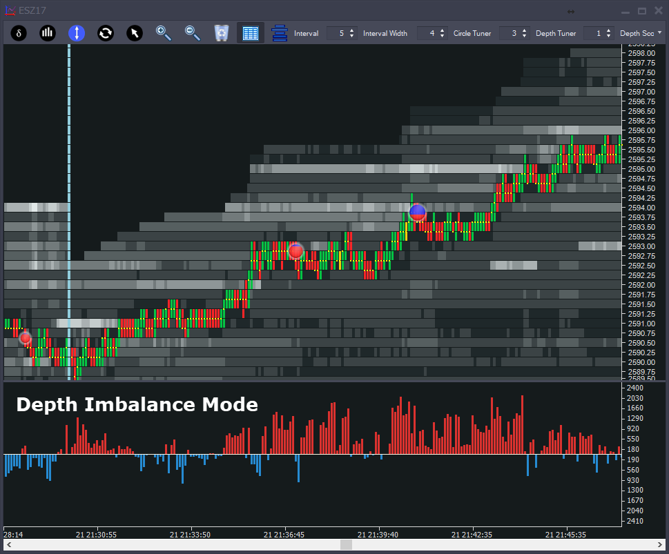
Note that more offers doesn't necessarily mean price will go down, the markets are often attracted do market depth. Also - in a move up - there's not much point bidding the market because you won't get a fill. This is especially true on thicker markets like the S&P 500 Futures above. So don't just look for "red means buy, blue means sell". It's nuanced.